
The 2016 meeting of the North American Cartographic Information Society was held in Colorado Springs, CO, and if you were there on Friday October 21st at 10:40am, you had a really difficult decision to make.
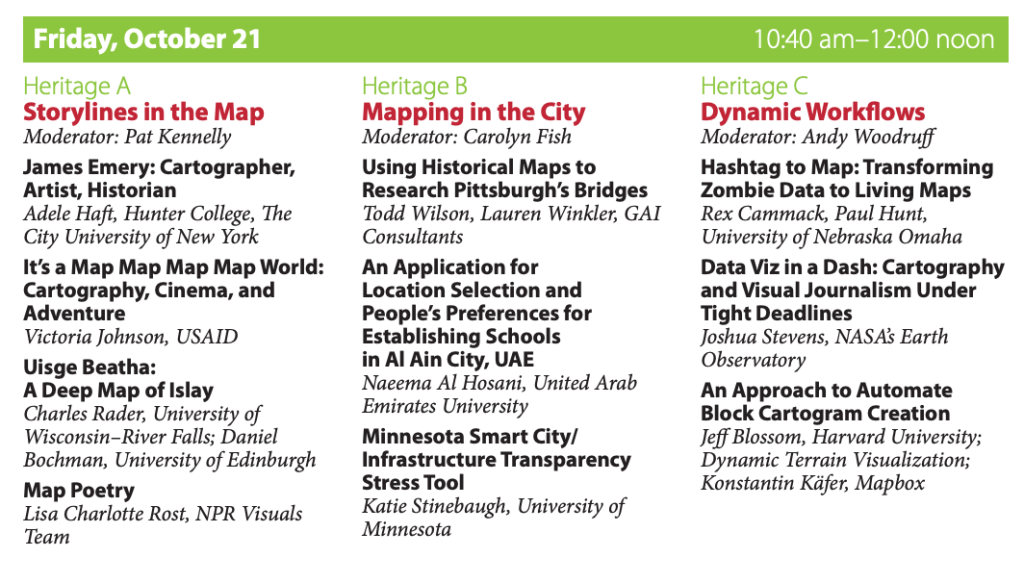
I don’t know what you would have chosen here, but I can actually only tell you about one of these sessions, because 2016 was the last year that NACIS didn’t record presentations! So I don’t know exactly what happened in Heritage B or C, but Heritage A was a blast. Adele Haft dazzled us with history, Charles Rader & Daniel Bochman transported us with terroir, and Lisa Charlotte Rost enchanted us with poetry. And I showed a lot of gifs.
I was a contractor for USAID in 2016 and could not talk about my actual work, but I love to talk about maps, so I researched and delivered a presentation on maps in movies. This talk was basically lost to time until cartographer/educator/pal Ashley Nepp reached out asking if I still had any of the materials and with surprisingly little effort given that the file was saved as “TAAAALK,” I pulled it out of an equally unhelpfully-named folder and, wow, I had pretty good notes for this one! Good enough that I can resurrect it here, now, as a blog post. If I were giving this talk now I might make some different choices, but in the interest of accuracy, this is essentially the exact talk I gave ten years ago. Please take your seats for an encore presentation of…
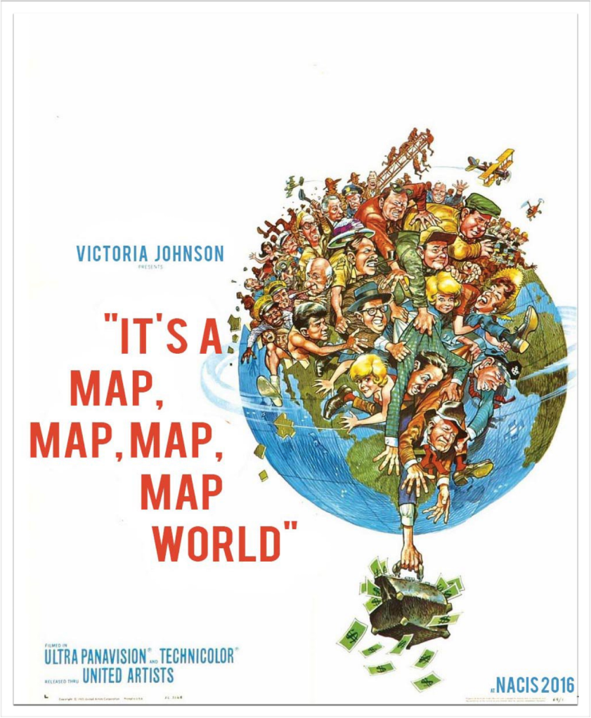
Hi! I’m Vicky, I support1 USAID’s Office of Afghanistan and Pakistan Affairs. This presentation is not about that!
Like many of you, maps are not just my job, they’re also my hobby. Whenever I spot a good map, or a bad map, or a weird map in any sort of media, I’m paying closer attention. And when you’re paying attention, you start to notice patterns.
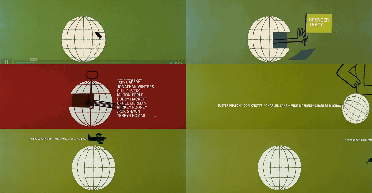
I’m sure any typophiles will recognize that these are selections from the nearly 5 minute long Saul Bass-designed opening titles for It’s A Mad Mad Mad Mad World.
The last time we talked, my presentation last year, was cartography in children’s and fantasy literature2. And maps in film are similar. No, you don’t get a little map along with your theatre ticket. Though that would be nice. But when a map appears in a movie, the on-screen map draws the viewer in and demands, more so than most other visual props, demands that the scene be viewed through a different eye. Production and Set Design are practically art forms, and what you see on screen are all choices made by the filmmakers. Background props, the way a shot is framed, everything that is and is not included is a deliberate decision. If there is a map, they want you to look at it. Nothing is by chance, and this is important, because maps are already a familiar item. You don’t have to be a cartographer to recognize a map. I mean, no one looks at a map and goes ‘what are those Ca-RaAaZy lines?’
We’re going to run through 5 loose categories of movie maps:
- Extra-textual maps, where the audience is shown a map that the characters do not see. It’s giving the viewer additional information.
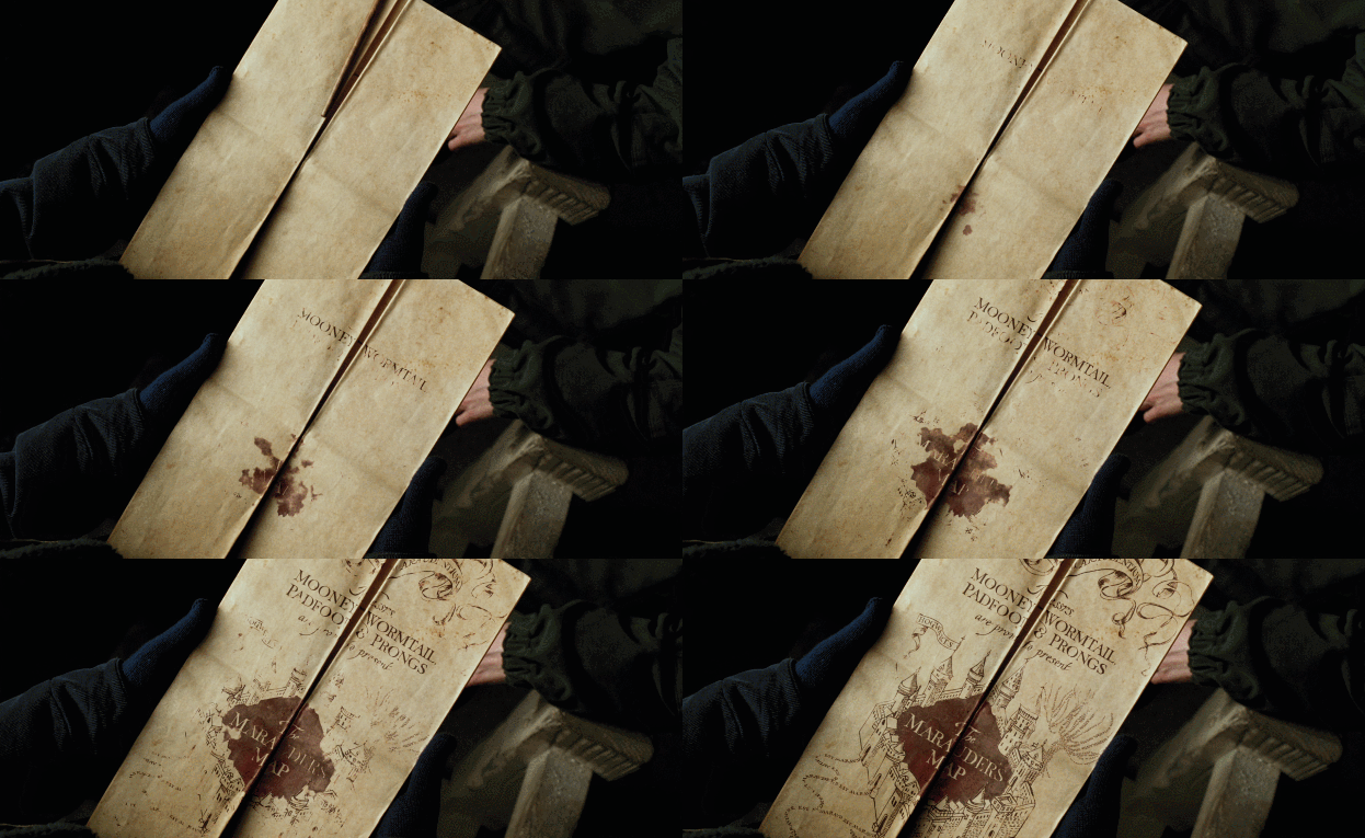
- Setting maps, where maps are used by the characters. Like the Marauder’s Map here.
- Plot maps, where the map is used to drive the story forward.
- Threat maps, the audience is shown the physical scale of destruction.
- And quick jokes, because maps are a great source for visual comedy
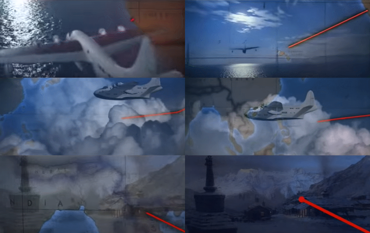
Extra-textual maps. They’re purely for the audience, the characters typically don’t directly interact with them. Non-diegetic maps.
Now, when I put out a call for map scenes in movies (I wanted to make sure I covered as much as possible), the number one answer was Indiana Jones and the Raiders of the Lost Ark, so that’s where we’ll start. It could possibly be the most well known map in film. Arguably, for sure. And it’s not even part of the plot, that is, this map does not exist in the film’s world.
It shows, rather than tells, that the action is moving from one locale to another by taking a thick red line to our hero’s path over a map. Even though it’s only onscreen for a few seconds, care was put in to making it look appropriate for the time period.
By organically incorporating cartography into the story, and sort of hinting at our modern idea of treasure maps, it’s an implicit likening of Indy’s search for the lost ark to those treasure maps, even though his quest doesn’t involve this kind of paper map. But it starts those wheels turning.
I don’t think this was the first occurrence of this style on film, but it is probably the most well known….

…and as with most iconic scenes, it has become an easily parodied trope. Here, from 2011’s The Muppets, Fozzie Bear has a “Travel by Map” button right on the dashboard, which conveniently allows the crew to travel from Illinois to France without leaving their car.
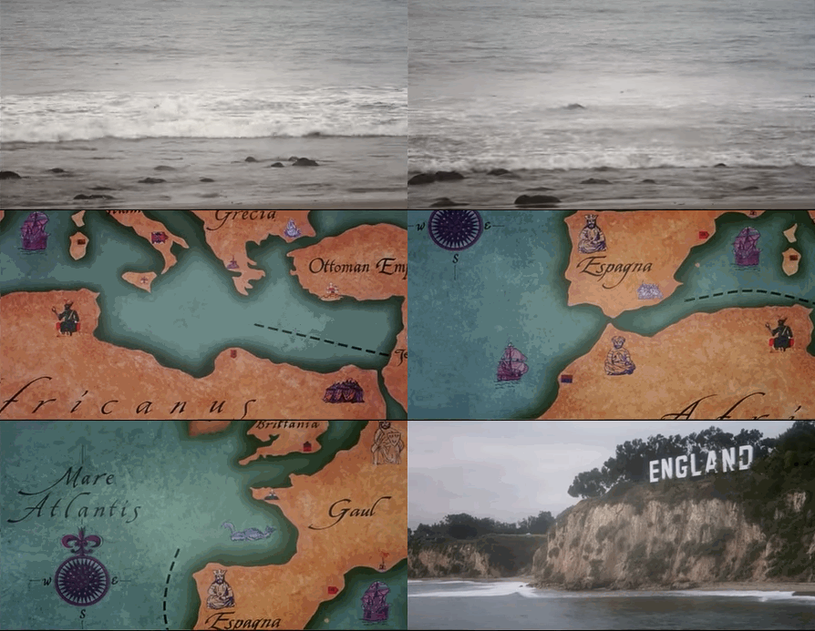
1993’s Robin Hood: Men in Tights does this as well. While this map plays at historical accuracy, modern day Türkiye is labeled as the Ottoman Empire, which was not founded until 1299 AD, about 100 years after the Robin Hood stories are supposed to have taken place.
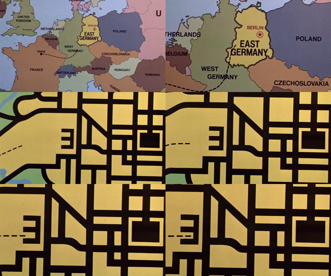
1984’s Top Secret! pulls the map line into another joke…
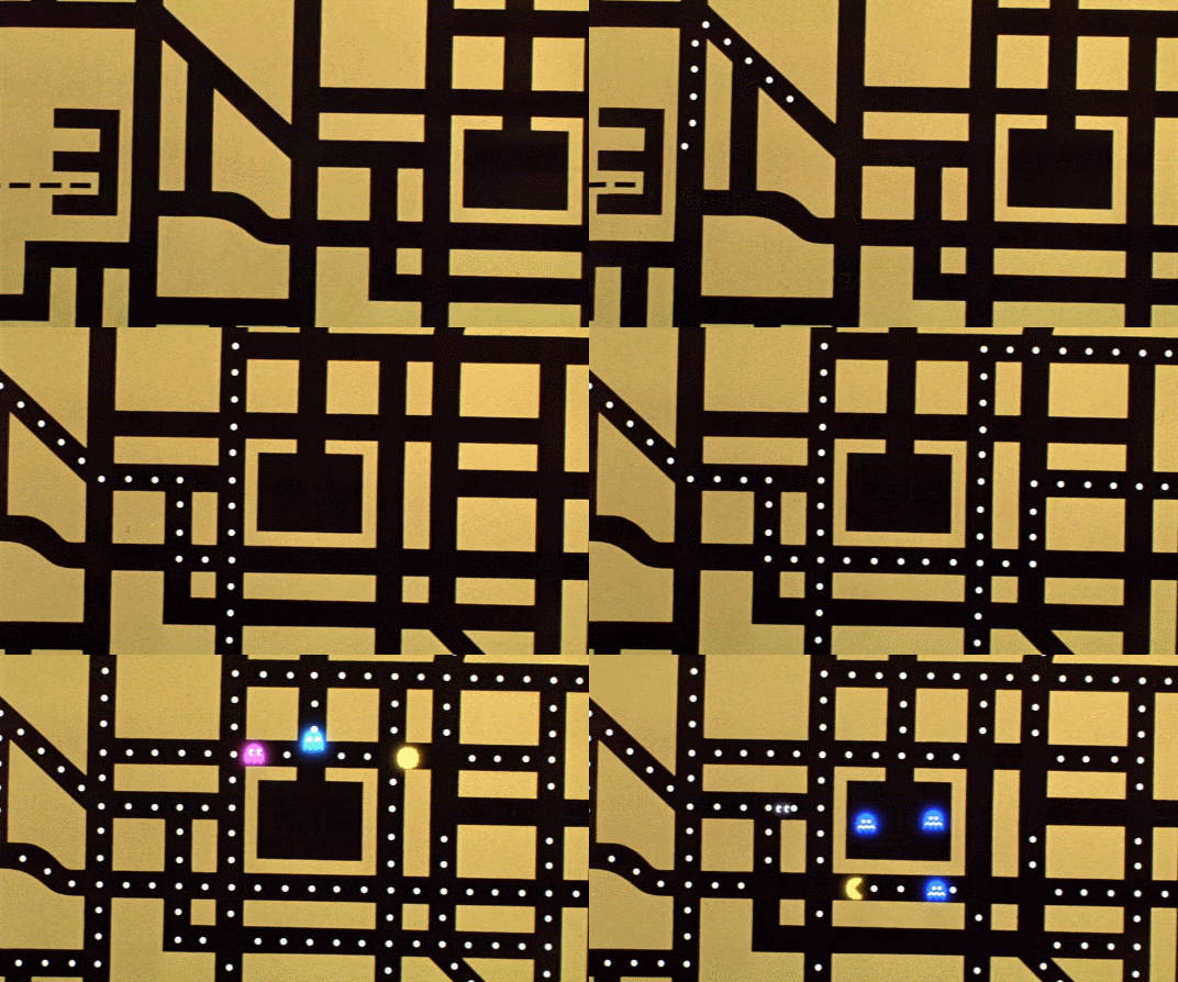
…continued here, making it both an extratextual map and joke map, as it becomes a Pac-Man game.
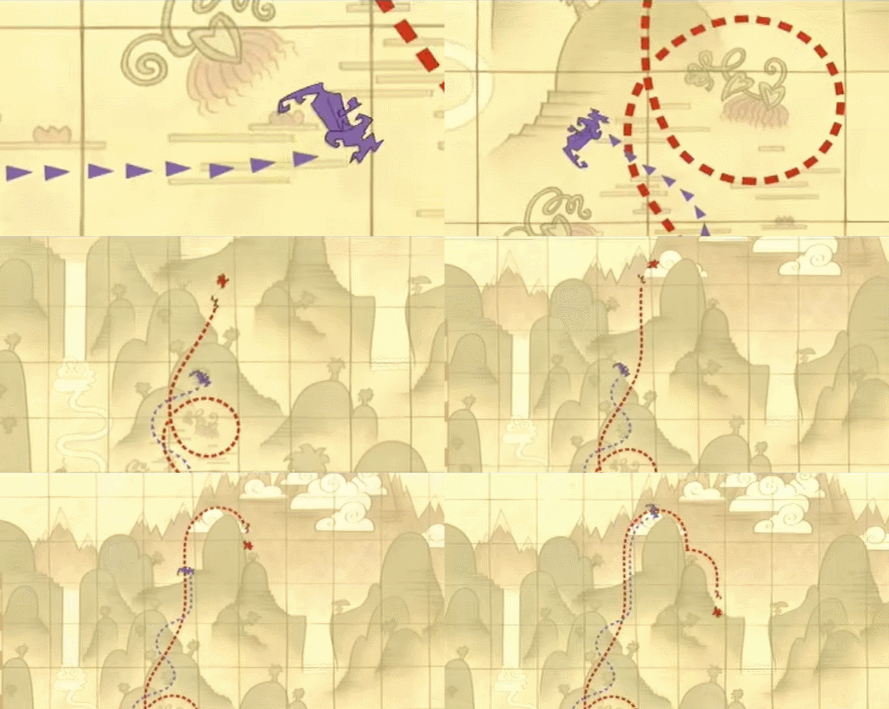
The Emperors New Groove takes it a step further, showing the map line…
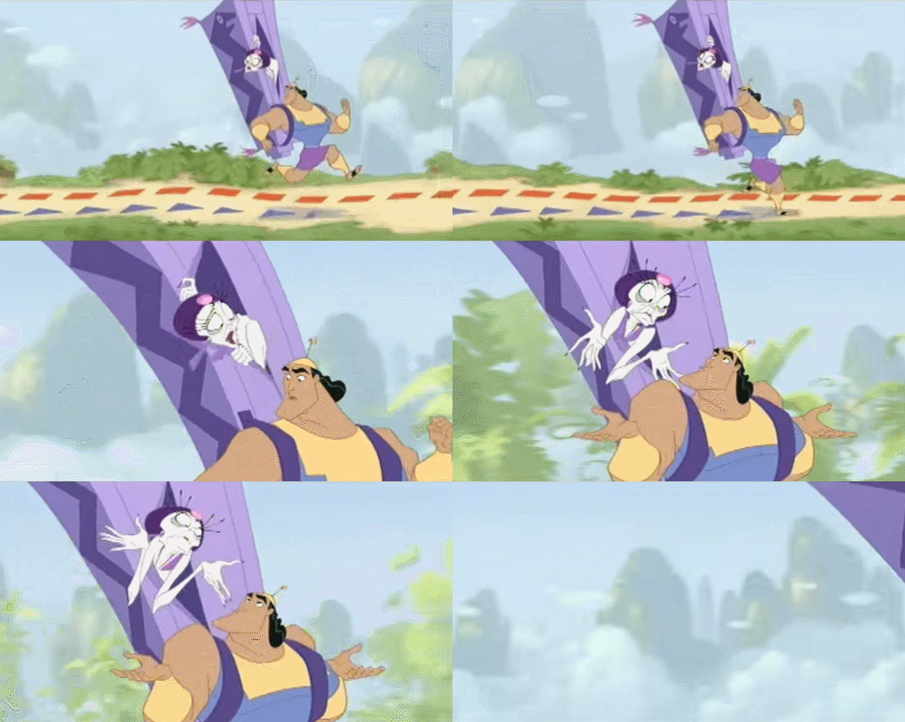
…and then showing the characters acknowledging the map line.
There are dozens of other examples of these kind of maps, but as they’re all thematically similar it’s sort of pointless to show many more. So consider this is my super smooth transition, with a movie that uses both extra textual and setting maps.
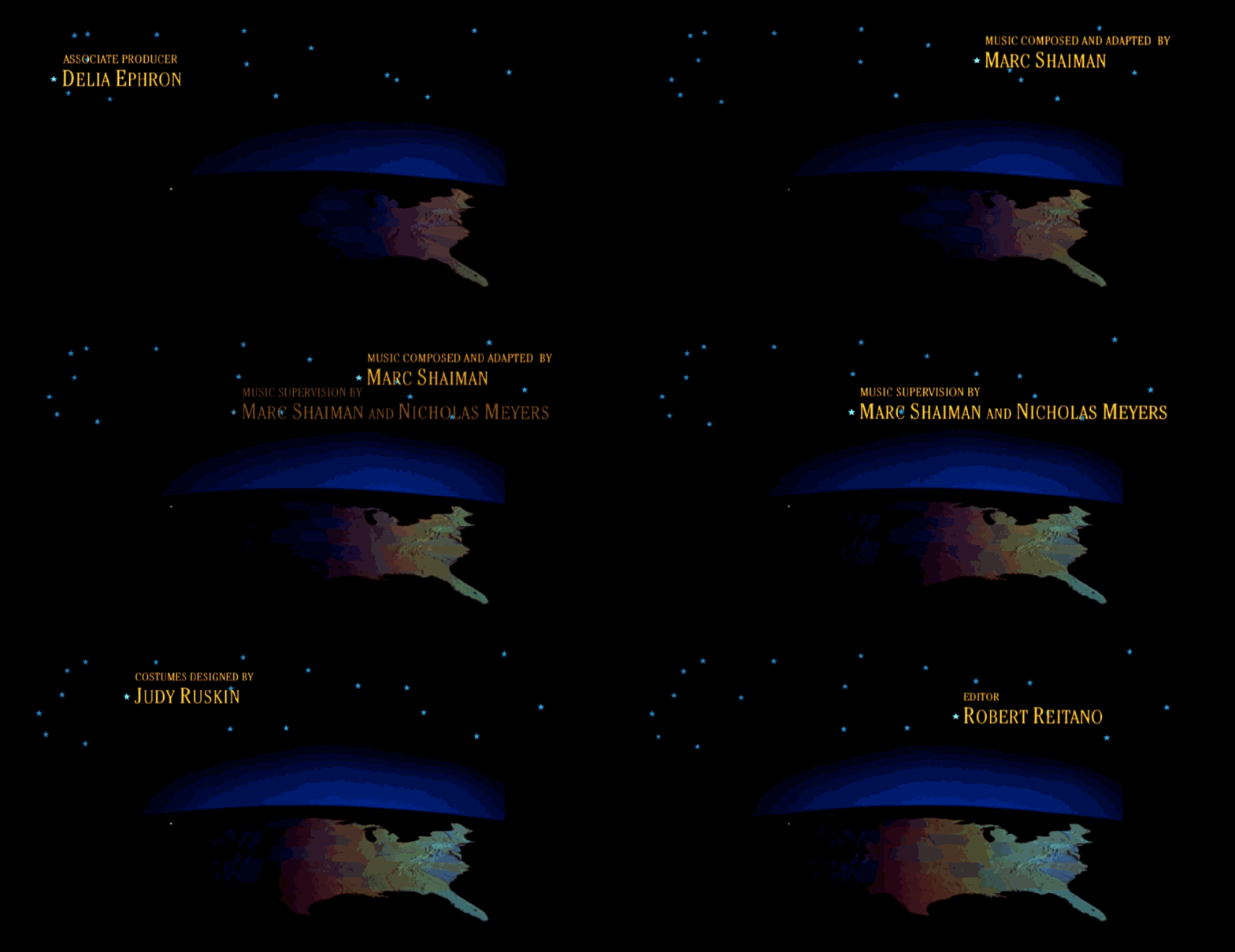
This talk is supposed to be about adventure movies, but if Katie Kowalsky’s PCD talk3 taught us anything, it’s that love, cartography, and adventure go hand in hand, in hand. So 1993’s Sleepless in Seattle, as a way of hammering home that our two protagonists are separated by geography, has a strong cartographic motif throughout.
The credits open with a map of the Continental US as the sun rises and sets, points of light in Seattle and Baltimore, opposite sides of the country. Each is covered with darkness, to show that they’re both sleepless, I suppose. Before the story even begins, the scene is already set for the viewer.
I always grit my teeth a bit when someone says “it’s like [wherever location] is a character!” but here, is pretty much actually is. I mean, cartography is right there in the credits. Unstated, sure, but present.
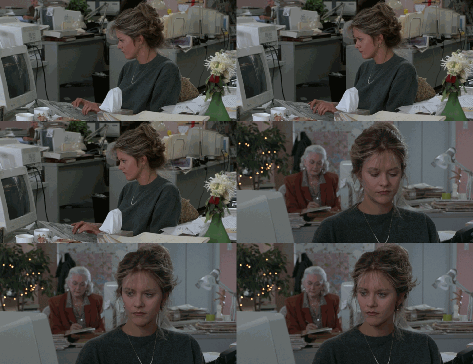
It keeps coming up. When Meg Ryan first searches for Tom Hanks’ location, the set design almost gives her a Baltimore-shaped thought bubble. It’s like saying that her location is on her mind as she begins her search. It’s there, in the frame, a visual placemark. Remember, no set design is accidental.
Thelma and Louise actually uses a lot of similar iconography to that used in Sleepless in Seattle, obviously to different ends, but if you want to read more about that check out Tom Conley’s Cartographic Cinema, it rules, I have a copy if you want to borrow it4. He approaches the subject from a more ideological perspective, and includes more foreign and avant-garde cinema. Mine is obviously more popcorn.
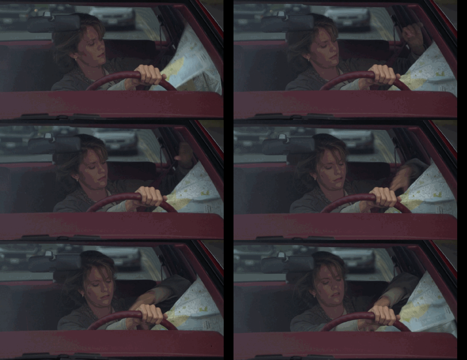
Meg Ryan’s frustration with this road map comes right at a low point for her morale. The filmmakers have taken the cartographic motif here, too, and universal frustration of folding a map is used to convey her emotional state.
There are actually a few more times where the cartographic motif makes an appearance, but you get the gist.
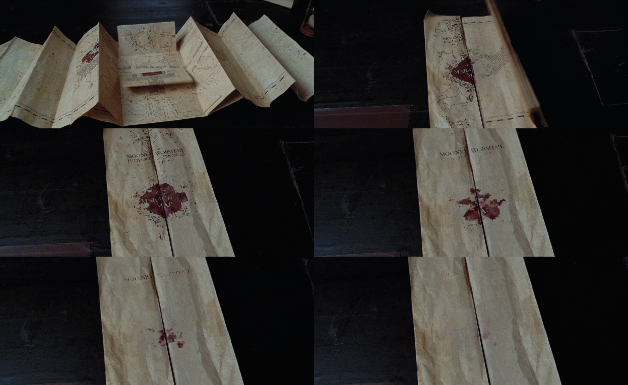
So speaking of folding maps, we’ve got the Marauders Map in the Harry Potter films. This is the ultimate map-as-living-document, a map that functions as a live view onto everything going on at Hogwarts. It’s bog standard cartography, pretty much, but it brings the fantasy element, even though the cartographic style is normal, which connects to us non-wizards and our map using experience, and imbues it with magic. It’s taking a map and using it as another channel to show how the magic world is different from our world.

Here’s just another view of the map in use. Wizards, they stay up late gazing in awe at cool maps just like us!
Plot Driver maps. These are the treasure maps, mostly treasure maps. This is a quick section, because there isn’t a lot of meat to these. These maps exist in fiction way more than anywhere else, thanks to Robert Louis Stevenson’s Treasure Island. And they mostly follow the same path.
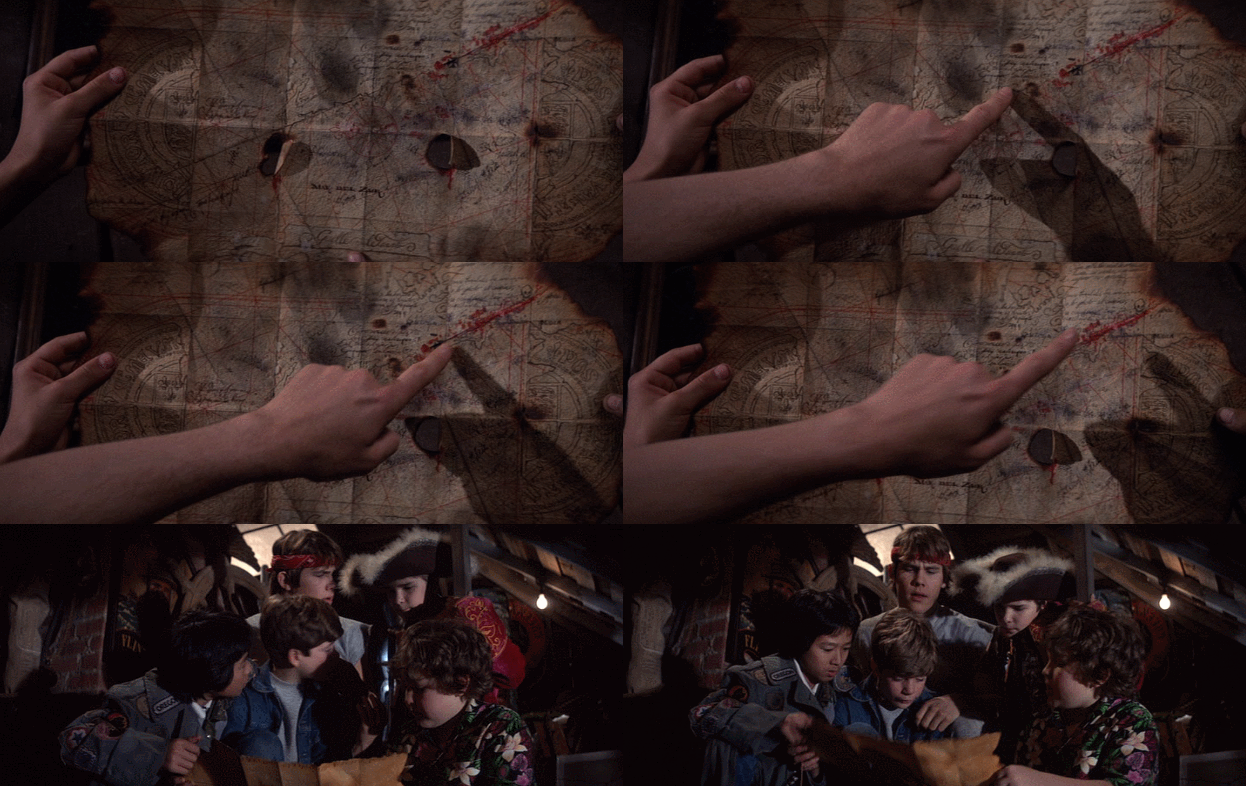
1985’s The Goonies is a great example. Like, if you close your eyes and picture a treasure map, it probably looks something like this one, right? And like, there are plenty of weathered old maps, but treasure maps just have that look. And usually a giant X.
I think of treasure maps like former Supreme Court Justice Potter Stewart thinks of pornography: you know it when you see it.
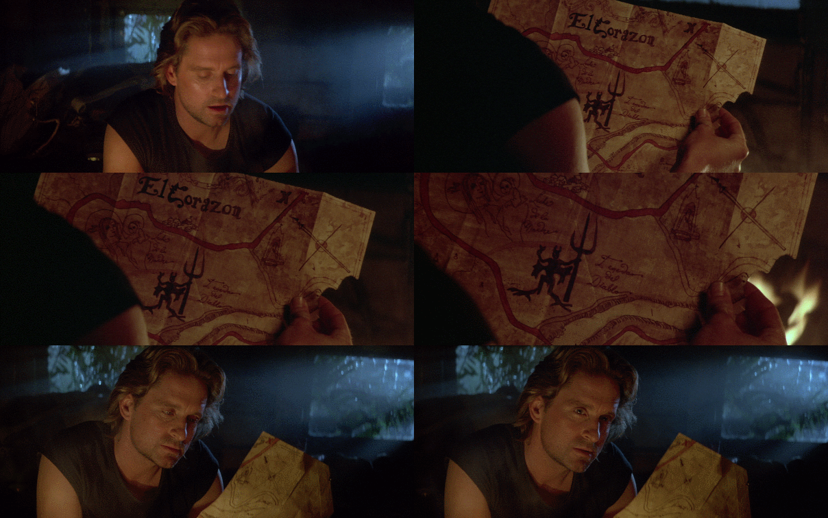
Similarly, the map to the El Corazon in Romancing the Stone. Like, what else could that be. You look at that and theres no mistaking what its purpose is.
Using a map as a plot driver, it isn’t really about the cartography so much as it’s about a reason to advance the plot. But even then, these on-screen maps are highlighted throughout the film as the characters read the maps. It’s quite clever cartography. The maps have to be designed to walk a fine line, so that the audience doesn’t figure out all of the twists before they’re revealed.
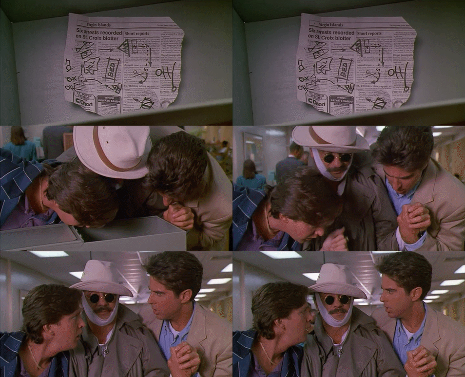
Weekend at Bernie’s II and City Slickers II: The Legend of Curly’s Gold are basically the same movie: early 1990s sequels, a mysterious map with the promise of untold riches, two bumbling dudes learning lessons about life and friendship from a dead guy.
I like the Weekend at Bernie’s II map a little better than the City Slickers II one, just because it departs from the established treasure map trope of a weathered, yellow-brown document from the past and instead uses a scrap of newspaper with some shoddily sharpie’d markings.
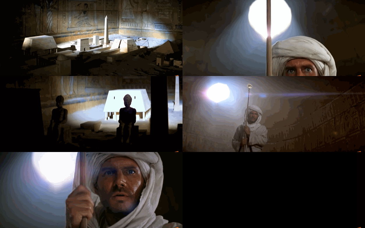
It isn’t all paper maps, though. If we go back to Indiana Jones and the Raiders of the Lost Ark, a fun example of interactive cartography, where the gold disc combined with the right height staff points to the correct location of the treasure on a scale map of the city.
A similar sort of sun-dependent device appears in National Treasure. I’m not a fan of this style – it relies on both an assurance that nothing will have changed or have been moved over possibly hundred of years, AND our characters will have lucked out on a sunny day. The cartographer can’t do much about the latter, but even if a mild earthquake knocked a single thing out of alignment….
And depending on the sun’s position in the sky, you have to be there on the right day? Of course, I can chill out, there is no need to get super nitpicky here, these are movies.
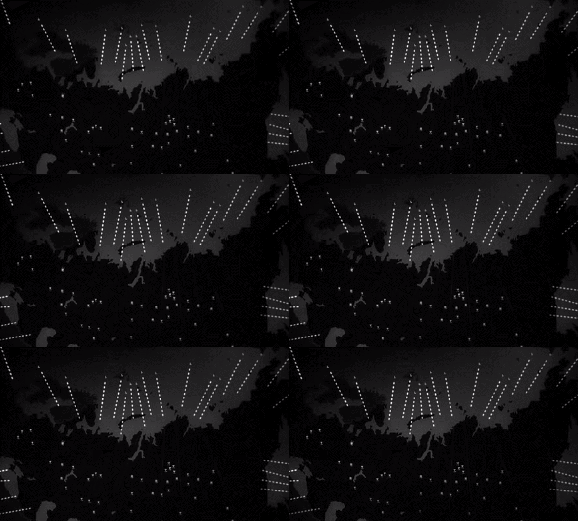
And finally, threat maps. I love these. There are so many. Cartography is a supremely effective way to convey a scale of destruction, and it’s usually destruction, in a visual manner. These are typically massive maps, often involving models of huge areas. You say “there are 14 planes loaded with nukes closing in on the Soviet Union,” okay, sure. You show the 14 planes loaded with nukes closing in on the Soviet Union, it has impact.
I’m talking of course about Dr Strangelove. The War Room in Dr Strangelove appears throughout the film, and as time passes the dots, symbolizing the planes, get closer and closer to their targets.
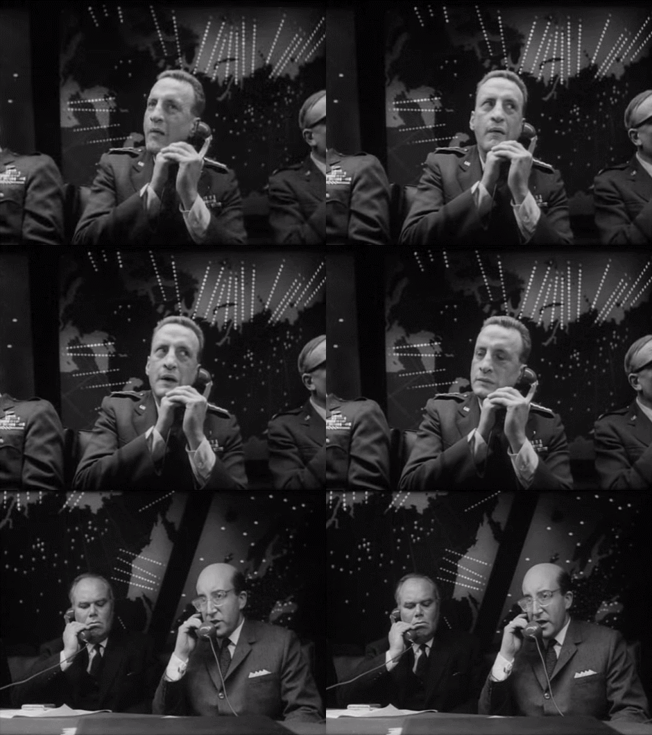
It creates a sense of looming terror, wholly unspoken, always there in the background. No matter what the characters are doing, it is a constant presence, creating a sense of claustrophobia as these lines get closer and closer. It’s incredible set design.
The sheer starkness, this is no-frills cartography here, makes it immediately clear to the audience: serious business. Despite whatever else may have been going on in the world, it has all been cleared away in favor of these planes and their paths.
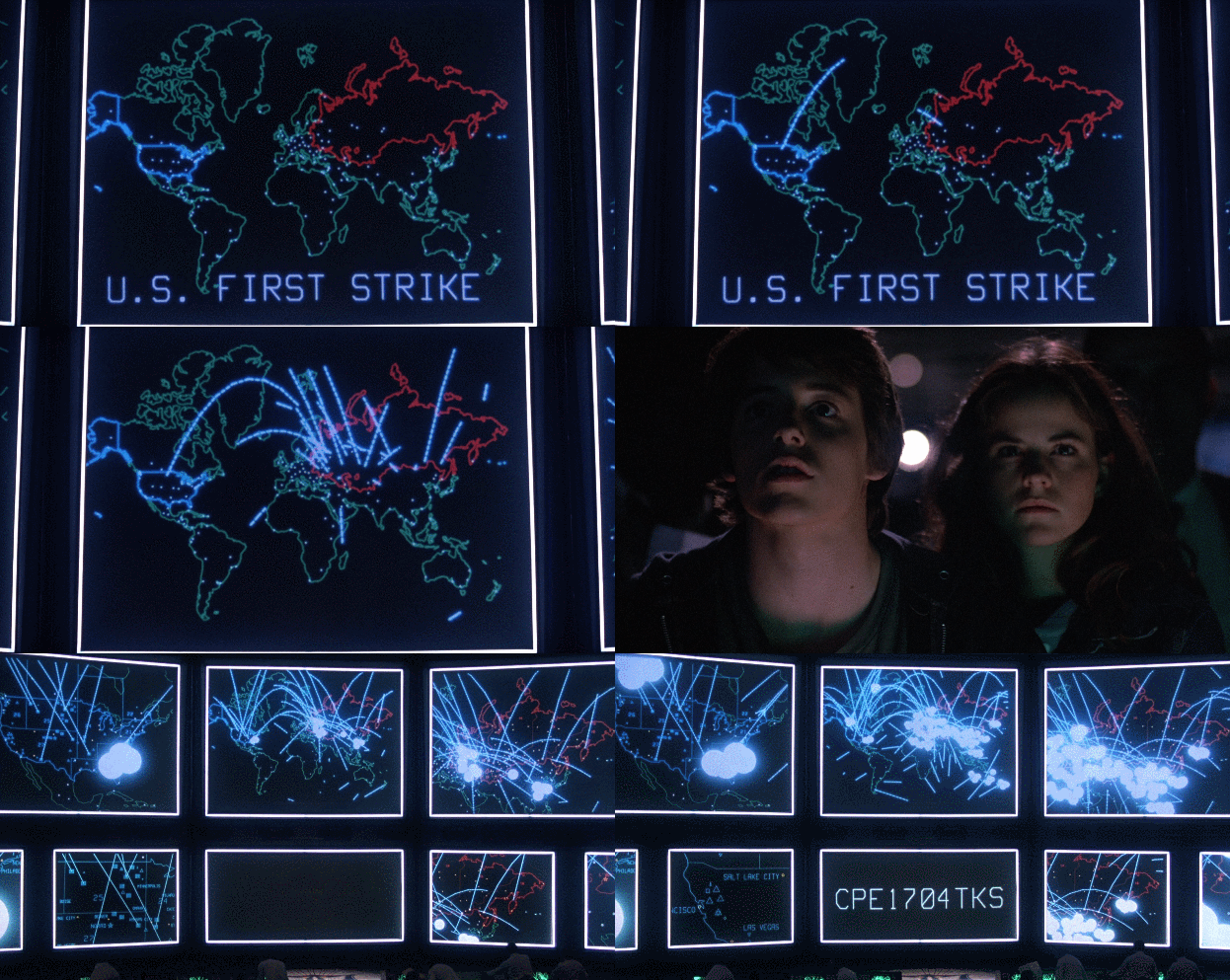
War Games, too, uses a world map to demonstrate a simulated nuclear catastrophe. Though with sweet 80s graphics!
Here, the cartography is super minimalist, though color is used to show the US in blue and the Reds in red.
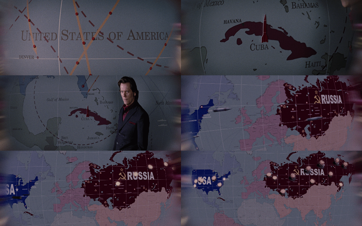
And one more, from X-Men: First Class, also using the same color scheme, and takes the nuclear catastrophe scenario and stylizes it as cartography, showing the missles flying on a globe, a sort of visual synecdoche.
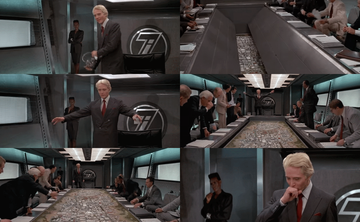
It doesn’t always have to be so serious. All the good-bad Bonds involve antagonists with giant maps. In A View to A Kill, Christopher Walken’s Max Zorin explains his plan to destroy Silicon Valley by unveiling a scale model of the area and going into detail about how much of the industry is based there, how he’s going to activate the Hayward and San Andreas fault lines to flood the place. Sure, you can just say that, but your point is so much stronger with a giant map.
This scene takes place on a blimp after an extended horse doping subplot. It is a great film.
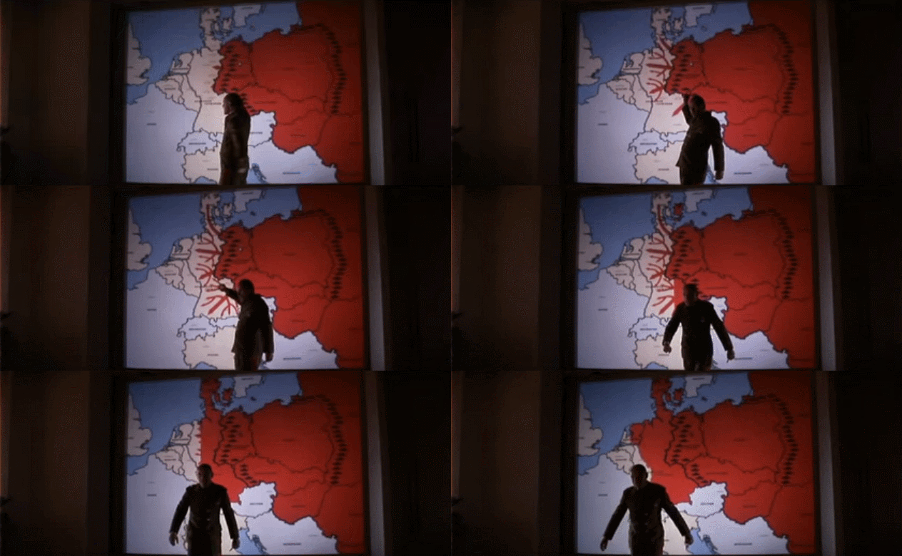
Octopussy: again, a Bond villain making his point with a giant map.
I know these are the bad guys, but the cartographic profession in these fictional worlds seems fun, sometimes. No one ever asks me to make a larger-than-life octopus-style map. Megalomaniacs, call me!
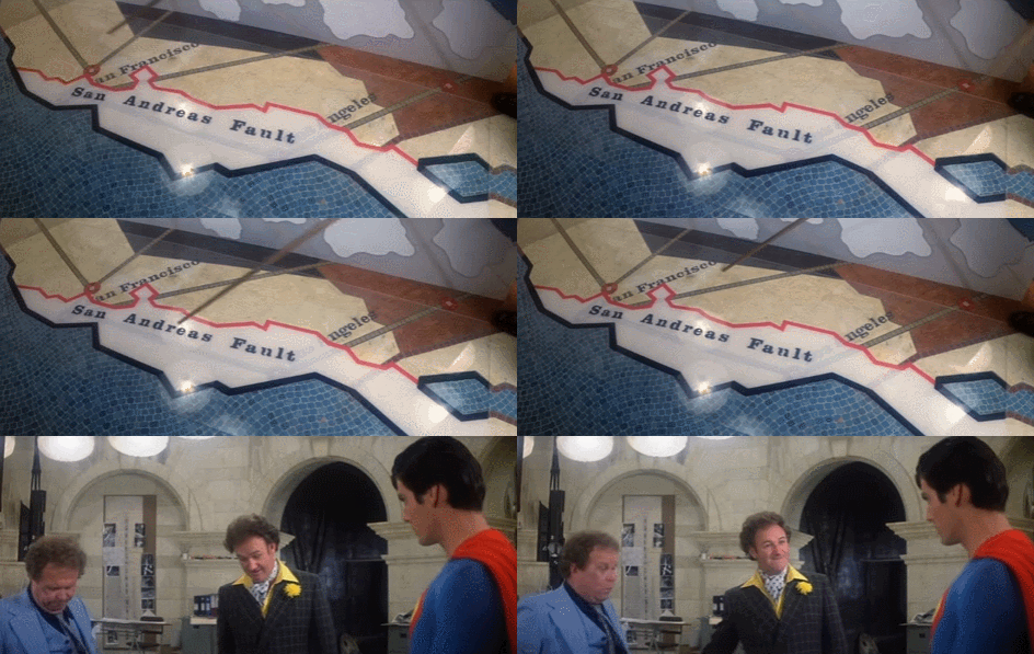
In the movie Superman, another plot hinges on the San Andreas fault, arguably weirder! Lex Luthor is plotting to buy up barren desert property on the east side of the fault, then divert a nuclear missile to strike the fault and cause an earthquake large enough to sink the land to the west, giving Luthor some cheap beachfront property. Yes! It’s a real estate scheme! Great map though. Very straightforward. Easy to read.
And finally, some quick little jokes that didn’t really fit in the other categories, but I wanted to include because it seemed wrong to end on California falling into the sea.
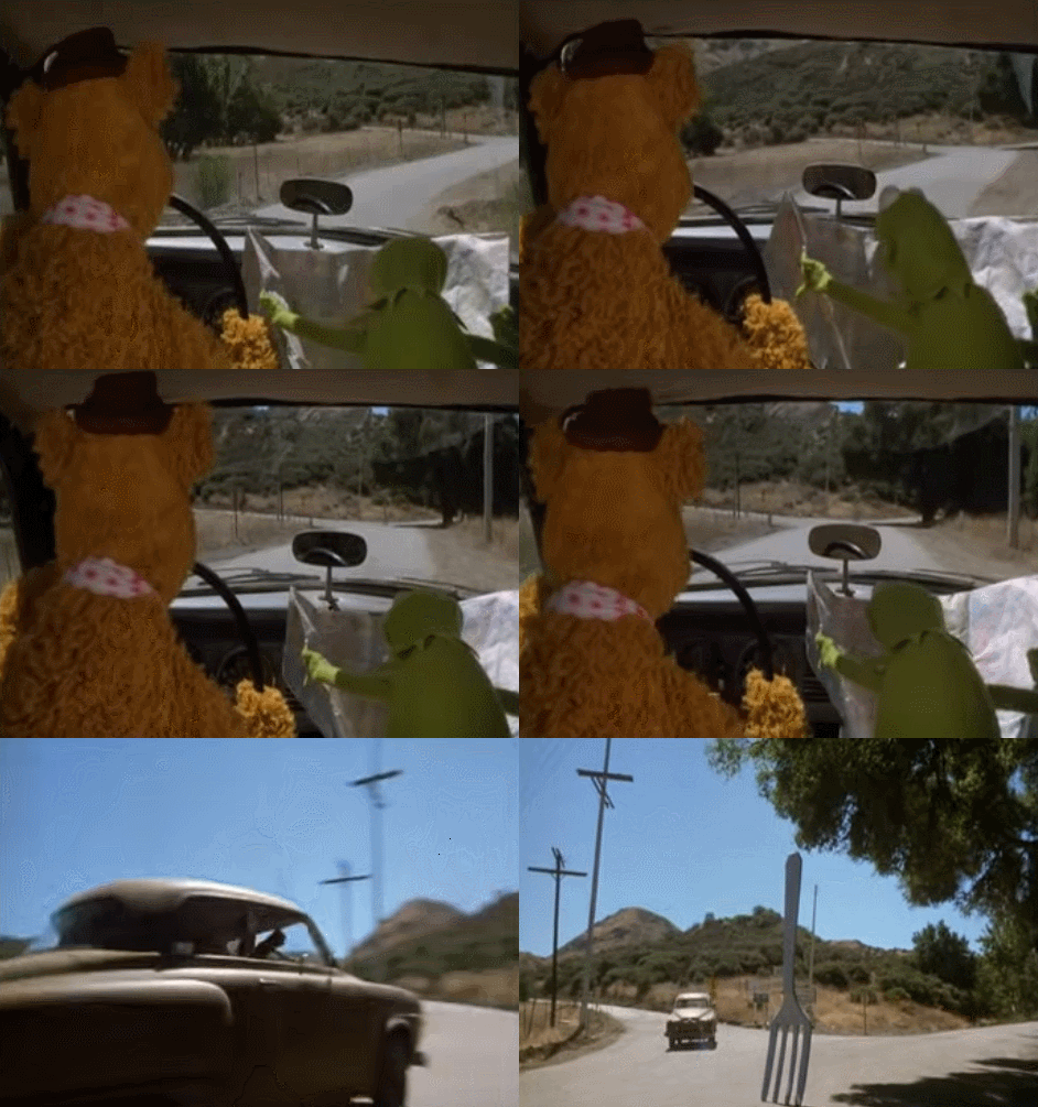
From The Muppet Movie: Kermit tells Fozzie to take a left at the fork in the road and well. There it is.
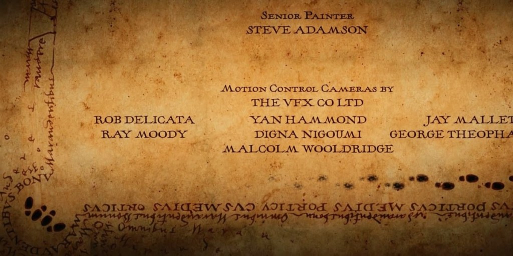
In the end credits of Harry Potter and the Prisoner of Azkaban, the marauders map returns and shows, right in the lower left corner, a pair of wizards getting quite cozy.
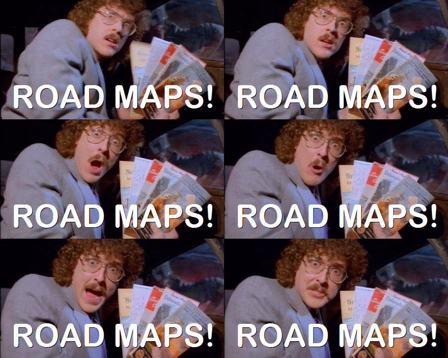
And finally, from UHF, what’s in Al Capone’s glove compartment? What else? Al Capone’s road maps!
- supportED, 2012-2017 ↩︎
- No recording of this one either but it’s foundation was in this piece I wrote for The Awl in 2012 ↩︎
- Her talk was “Breaking up With Raster and Going Steady With Vector Tiles Cartographer meets map tiles. That infamous meet-cute has caused scores of love, commitment, and eventual heartbreak for all of us in web mapping. The technology behind tiles is constantly changing, growing, and expanding-but where does that leave a cartographer? Are the limits of raster tiles worth abandoning for the mysterious, bad boy vector tiles? This talk will impart the
wisdom of how a cartographer’s quest for true love in her tiling scheme and possible workflows can adapt smoothly
to a new relationship with vector tiles.” Katie is a gem. ↩︎ - Still do, you can still borrow it. ↩︎


Leave a Reply