
and timeline-d?
Earlier this year The Guardian put out a list of the 100 Best Novels of All Time. Great list. Love a list. This one in particular seemed very thoughtfully assembled, a lot of different perspectives coming together to form a comprehensive view of the best novels in the English language (written in any language as long as it’s been published in English at some point1).
I rather liked this list, which is good because I’ve spent a lot of time with it lately. It’s not the Calvino2 I would have picked and The Rings of Saturn should be higher but, you know, minor quibbles, standard stuff for lists published on the internet. And yet…when I was reading through that list, checking off what I’ve read and such…dang a lot of London in here? A lot of Regency era?
Are the best novels of all time really all about Regency London?
I needed to know.
So I made a map3. I opened up a spreadsheet and started marking down information, going through the list and noting where and when each story took place. This is more complicated than it sounds; I have only read 30 or so of the listed novels. I reread one…but mostly read a lot of wikipedia pages 🤷♀️4. The problems with putting stories on a map and timeline presented themselves almost as soon as I started: number 91, The Left Hand of Darkness by Ursula K Le Guin, does not take place on this planet. Or in a stated year. Also it’s in the future. Hard to map. Number 54, Orlando by Virginia Woolf, takes place over 300 years. Herman Melville’s Moby-Dick, number 15, spans oceans. Number 72, Kindred by Octavia Butler takes place in 1976 Los Angeles and 19th century Maryland. Part of what makes these novels so great is their complexity, why wouldn’t that extend to their settings?
This is what that looks like on the page.

A caveat: A lot of these stories do not have very clear indicators of when and where they take place. I estimated a rough range, I plonked a dot on a map. It may not be as precise as you would like about your favorite novel and if that is the case: PLEASE contact me5 and let me know so I can make the adjustment. While many of these stories take place in multiple locations, only stories where the journey is the point have a line extending from the story origin location. Those are The Rings of Saturn, Blood Meridian, The Road, Moby-Dick, and Kindred. This was a judgement call, I reserve the right to adjust.
Anyway, to answer my initial question, it’s pretty clear from the map that the most common location is London, with a lot in the UK and Western/Central Europe. Though The Transit of Venus is written by Australian Shirley Hazzard and is about a pair of Australian sisters, it is set mostly in Britain. Large swaths of the Southern Hemisphere are missing from this list, I’m not sure whether to chalk that up to translation, bias, or some third thing. Hard to say.
By start year, 28% are Victorian set, followed by 22% Edwardian. Only six are Regency, I suspect that it seems heavier because those six (Pride and Prejudice, Emma, Great Expectations, Persuasion, Vanity Fair, David Copperfield) are pretty well known. All of these are common school required reading and/or have been made into movies in the past few decades, so they stick more in the brain, I guess?
The year with the most possible novels happening at once is 1913, which means there are 15(!) stories here that could theoretically cross paths that year. The most likely of those would be a Jacob’s Room x Orlando all-Woolf blockbuster crossover event as both take place at least at some point in London6.
Some other points of interest:
- Orlando takes place over 300 years. By contrast, James Joyce’s Ulysses is only one day.
- In both setting and publishing there’s a huge gap between the earliest and the second earliest novels. Invisible Cities is set in the 1270s, then there’s nothing until Wolf Hall in 1500. Don Quixote was published in 1605, the next is Pride and Prejudice, published 1813.
- The most recently published novel on the list is My Brilliant Friend, number 51, published in 2011. The closest book setting to 2026 on the list, excluding ones in an indeterminate future, would be The Vegetarian‘s 2007.
I made this map using ArcGIS Pro and ArcGIS Maps for Creative Cloud. The gantt chart was produced with my favorite free chart maker, rawgraphs.io. I used Adobe Illustrator to pull it all together.
This was originally intended to be just a map poster, a lark for the NACIS Map Gallery7. I entered it into the Esri UC Map Gallery, where to my delight it was accepted, giving me the opportunity to get heaps of in person feedback.
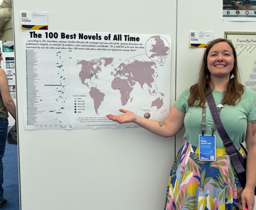
Every time I popped by the gallery space there were attendees examining my work. When I wasn’t rushing to another session, I stopped and asked what they thought, what questions they had, any sort of feedback they could offer8. And offer they did! The map you see above was edited after the fact to incorporate the top two pieces of feedback:
- Label the axes on the gantt chart. This is kind of the duh oversight that can happen when you’ve spent a lot of time working with the map and data, you miss the obvious initial entry points. Really drives home why feedback loops are crucial to any design process.
- Mute the background text. In a fun map like this, I like to add little easter eggs to reward a viewer willing to look closer9. The light grey texture in the background are the first lines from all 100 novels. In the Map Gallery printed version they were a touch more prominent; in response to viewer feedback I de-emphasized them. This kind of design element is not crucial to understanding the map and is fine at the very bottom of the visual hierarchy.
The other major piece of feedback was a request for an interactive version, so viewers could explore the data in depth on their own time.
I’ve made lots of interactive maps with ArcGIS SDK for JavaScript, but I was stumped by how to structure the timeline so it worked in coordination with the map. After some time wading through help docs and web resources to understand the scope of the project, I decided to use AI for coding assistance (Claude, to be precise). I will be up front about this, I do not really like AI, especially image generation AI, for lots of reasons10. But I’m not totally opposed to it, and I think there are some benefits to the tool. Here I used it to supplement my own javascript knowledge through efficient troubleshooting and refinement where I found myself blocked. A lot of AI proponents will tell you that this is the future; if it that is the case I want to be able to use it effectively and responsibly. I think I achieved that here, more or less. The tool is about as janky as it would have been had I built it totally from scratch, because I followed my own design process (in other words, it isn’t vibe coded).
I don’t feel the same pride in creation for the AI-assisted interactive map as I do in the static version, which is a weird feeling after putting something out in the world with my name on it that I think of as pretty cool. I like the process of making things of which I can be proud. I like baking from scratch, I like sitting at a drum kit and creating a beat, I like making something new that is wholly my own, so using AI feels like cheating. That said, building this project with assistive AI started with my existing abilities and helped me bolster the skills I’ll need to build the next thing. I look forward to building other tools and data visualizations using what I learned doing this, which will become part of the process of making things. I might use assistive AI again, I might not, but whatever it is…11
- More on how the list was compiled here. ↩︎
- If on a winter’s night a traveler ↩︎
- how I solve most problems tbh ↩︎
- Spoiler alert: they’re windmills ↩︎
- victoria dot johnson at gmail dot com ↩︎
- but it’s fun to think about Rebecca‘s Mrs Danvers coexisting with Behemoth the cat from The Master and Margarita (both 1930s), or the wacky hijinks possible when Wuthering Heights meets Frankenstein (both late 1700s). ↩︎
- Submissions open through August 31! ↩︎
- I also played a fun game of “spot the mistake and win a sticker,” which is a favorite tactic to invite close, critical inspection. When hanging the map I noticed a mislabeled dot…no one spotted that one, but they did spot something else I missed, plus offered thoughts on choices I made that could read as mistakes (like not labeling the axes!). ↩︎
- Can you spot the others? ↩︎
- on the print map I even noted that absolutely no AI was used because so many images you see these days are AI generated without attribution ↩︎
- there will be so many unnecessary footnotes ↩︎
 Vicky Johnson-Dahl